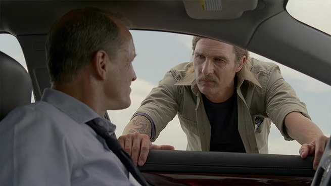
Colored by Steven Bodner
Light Iron NY
I was brought on board when they started scouting. I spoke to the DP, Adam Arkapaw during the testing stages and he sent various looks that he liked and thought would work for the show. We also had some in-depth conversations about what he was looking for. One of the references we spoke of, was the movie "Seven". I didn't have any interaction with the director, Cary Fukunaga prior to him coming to NY to do post.
I always try to maintain some shape in my highlights
- Steven Bodner -
Grading Technique
True Detective was shot on Kodak negative, mostly 5219 and 5207, and color corrected on DaVinci Resolve. I chose not to use any LUTs for the show as we wanted to have the most flexibility and didn't want to fight any curves. We scanned all the negatives to 2K DPX frames which I then graded.
I work differently depending on the show, the look and feel they are going for. For this show both Cary and Adam wanted everything to be very real and organic. After sitting with both of them I found it faster to use printer points and basic Log controls to get the primary balance done.
READ: Dan Muscarella about Printer Lights
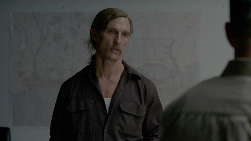
Once we had the primary balance where we wanted, I then watched it back with audio to see if the look matched the tone. I then used Linear controls to dig in and create some subtle differences in the separate areas of the image. As well as adjusting exposure and color temperature.
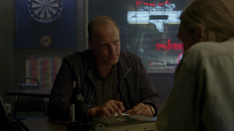
Matching shots
After I had what I felt was a good overall balance of color and brightness, I started paying attention to skin tones throughout. I was also looking if I needed to shade, vignette or pull anything out of the image.
Matching skin tones is a big part of making the scene look good. When you are watching these scenes, the object you are focused on from shot to shot is the actor's face and expression. If they are not matching from shot to shot, it's going to be very noticeable and quick for any one of us to point out. I didn't do much beauty work in color on this season. We did an occasional sharpening of eyes or softening of backgrounds but that was about it.
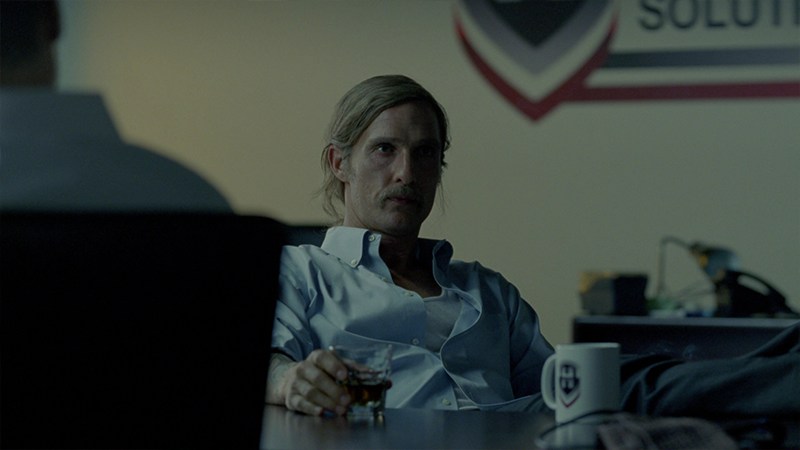

The most challenging scene was probably the one in episode 4. Cary and Adam did an amazing shot that lasted 6 minutes without a cut. They were going in and out of apartments, thru windows, in the light and dark. Cary had a very specific thought for how he wanted every turn to look. So needless to say we had a lot of color rides and tracking windows and dissolves throughout that scene.
I found it faster to use printer points and basic Log controls to get the primary balance done
- Steven Bodner -
Organic feel
Every scene is different. Whether it be the lighting, atmosphere, exposure or temperature. So my technique changes depending on what's needed.
I try to use windows more than keys. I feel like when you over use keys, it takes you away from the natural feel of what the DP actually captured. I think most people can feel when something is over keyed and too perfect. I prefer the organic feel myself. That's not to say I don't key and won't. Or that I didn't on this show. I definitely did. My preference is to get a good balance of color from the primary balance and then use shading and subtle windows or keys to just accentuate what the DP has done.
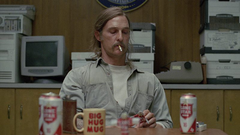
I also always try to maintain some shape in my highlights. I do everything in my power to not have a clipped white sky or highlights. This obviously depends on the scene and how it was shot. A softer highlight at times is nice. Again it's all personal preference and the feel of the scene.
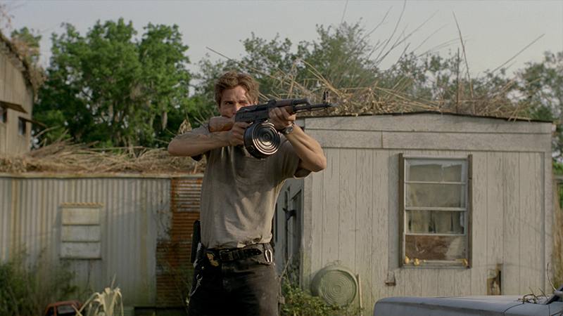

Every colorist works a little different and there is no one way to get something done. We work in a very subjective field. It's all about helping the director and DP see their vision in the end.
This was an amazing series to be a part of. From the DP and director to the editors and post staff.
Steven Bodner
All images and clips copyright © HBO