Colored by Jill Bogdanowicz
EFILM
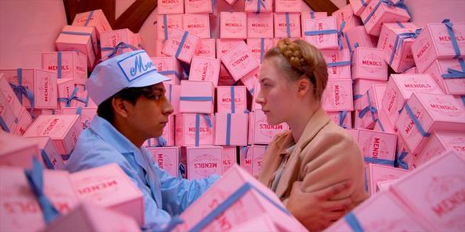
I was introduced to The Grand Budapest Hotel after the shoot was done, and after dailies, but early enough to establish looks for the film that would matter to VFX. Wes Anderson had a vision that included creating different palettes for different time periods in the movie. For the 30s, he wanted a less saturated look with light pinks and deep reds and purples, for the 60s a warmer, golden feel with rich yellows, golds and greens, and for present day, a more neutral palette.
If you add a strong element to the image, then you need to take something else away
- Jill bogdanowicz -
He also wanted to create a look based on old photochrome images from the early 1900s. He directed me to an online photochrome library from the Library of Congress. These looks would bookend the film.
It was a very collaborative process with Wes, we did spend a lot of time exploring different looks together. He would tell me what he wanted and I would do it, then give him different ideas of my own as we went along. The production design helped us choose colors to accentuate in each time period.
Grading technique
Grand Budapest Hotel was shot entirely on film. Each time period had a different aspect ratio, so we fit all 3 (2.40, 1.85, 4x3) all into a common canvas of 1.85. My starting point was the original scan, with a film emulation LUT in line, since we were grading in P3. My father, Mitchell Bogdanowicz, was the color scientist that designed the LUTs for this show. Mitch also designed several LUTs that gave a beautiful look of old photochrome.
Get access
This was a short excerpt, become a premium member to access the full article.
-
 9
9
-
 1
1
Recommended Comments
Join the conversation
You can post now and register later. If you have an account, sign in now to post with your account.
Note: Your post will require moderator approval before it will be visible.