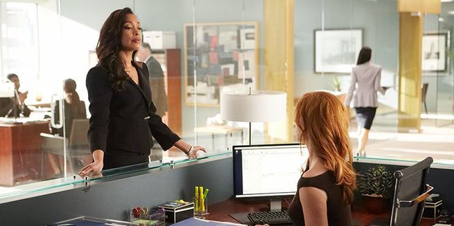
Colored by Chris Jacobson
4 Max Post Entertainment
I came to SUITS after the pilot got pickup to series for the USA network. At the time the look of the show was a bit edgy and ground-breaking in comparison to what the network was used to broadcasting. The network's standard look was blue skies, lots of color and not too much contrast, light-hearted. SUITs was dark, extremely contrasty, colorful but muted and stylized and edgy. This was done on purpose and everyone seemed to love it.
I prefer to work in Linear and then use the Log controls to tighten up the image
- Chris Jacobson -
When I came on SUITS, the Pilot had already been colored by another colorist and the basic look of the show was generally set. Through the many episodes, the show's look has evolved into what it is today. Now, I would describe the visual universe of the show as clean, tight, bold and sharp, a lot like the charters of the show. Rich contrast, saturated and crisp, no filters, curves or noise reduction.
Blue steel look
Season 5 that I'm currently working on is shot on the Alexa Amira 2K. Previous years it was shot on the normal Alexa at HD. I introduced more of a, what I like to call, "Blue Steel" look for the office. Teal blue is a big part of this look, but when I have time to create “a look”, I approach the image from several different ways in order to compare which approach will achieve the desired effect.
This was a short excerpt, become a premium member to access the full article.
Get access
-
 3
3
Recommended Comments
Join the conversation
You can post now and register later. If you have an account, sign in now to post with your account.
Note: Your post will require moderator approval before it will be visible.